There’s a story behind our logo.
Before becoming the logo you know today, the Zero Limit’ logo started with a few sketches on paper.
From the very beginning, the goal was to create a dynamic, modern visual identity that reflects sports, leisure, and outdoor activities.
But did you know that some of the shapes in our logo have a specific meaning ?
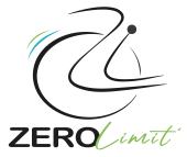
The person and wheelchair are formed from the Z and L of Zero Limit’, while the wheelchair wheel represents the zero.
Little by little, the first sketches evolved, the shapes became more defined, and colour was added to complete the design, thanks in part to the wonderful work of Marion Filippi, eventually creating the logo we use today.
Today, this logo reflects the spirit of Zero Limit’: opening up new possibilities and helping more people enjoy sports, leisure, and the outdoors. For any request, click here to contact us.